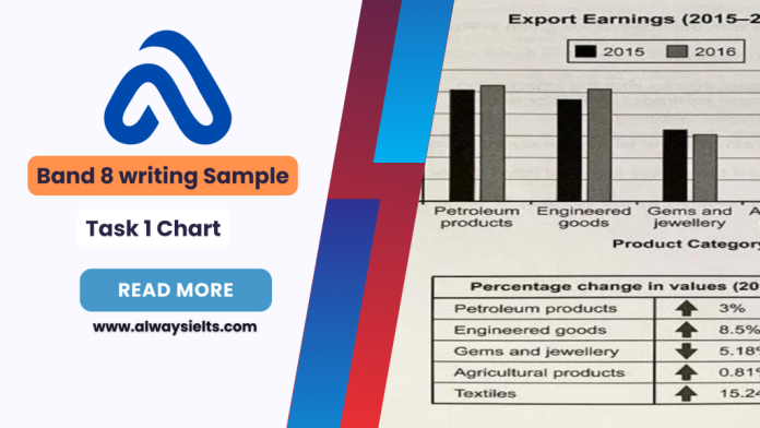
The chart below shows the value of one country’s exports in various categories during 2015 and 2016. The table shows the percentage change in each category of exports in 2016 compared with 2015. (Source: Cambridge IELTS 14) Here’s my band 9 sample answer: The bar chart and table give information about a country’s export earnings from five groups of products in 2015 and 2016. It is noticeable that export revenues in all but one of the five product categories increased over the period shown. While petroleum products were the highest-earning exports in both years, the textile industry saw the most significant growth in earnings. Export earnings from petroleum products rose from around $61 billion in 2015 to $63 billion in 2016, which was an increase of 3%. Income from engineered goods reached a similar level. The country’s export earnings from these goods went up by 8.5% to approximately $62 billion in 2016. From 2015 to 2016, there was a 15.24% increase in export revenue from textiles, with earnings rising from roughly $25 billion to over $30 billion. By contrast, there was almost no change in the amount of money earned from agricultural products, which remained at just over $30 billion. Finally, the only decline in income occurred in the gems and jewellery product group, where export earnings fell by around 5% to approximately $40 billion in 2016.


